Android 移动开发

接下来进入Android 的入门基础知识,来了解Android中的布局.Android中有六大布局,其中分别是 RelativeLayout(相对布局),LinearLayout(线性布局),TableLayout(表格布局) ,FrameLayout(帧布局),ConstraintLayout(约束布局),GridLayout(网格布局) . 在实际的界面布局中我们最常用的是使用线性布局与相对布局结合使用,这个能达到较好的页面效果
一、RelativeLayout 相对布局
RelativeLayout相对布局管理器,需要有一个参考对象来进行页面布局,所以性对布局的实现前提是要有一个参考的组件,例如桌面的顶端,左侧,右侧,底部
相对页面布局语法格式:
<RelativeLayout xmlns:android="http://schemas.android.com/apk/res/android" //这里写属性列表> </RelativeLayout> 123
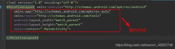
以标记开始以结束,属性后面是XML命名空间的属性
RelativeLayout 有以下主要属性:
gravity : 用于设置布局中的各个控件的对齐方式ignoreGravity: 用于分离gravity属性的控制RelativeLayout 提供了一个内部类,类中又提供了许多重要的属性来更好的控制界面中的各个控件,其支持XML属性:
(1)、以布局管理器作为参考的属性:
layout_alignParentTop: 布局管理器的顶部对齐layout_alignParentBotton: 布局管理器的底部对齐layout_alignParentLeft: 布局管理器的左对齐layout_alignParentRight: 布局管理器的右对齐layout_alignParentEnd: 新加入属性的右对齐layout_centerVertical: 布局管理器垂直居中layout_centerHorizontal: 布局管理器水平居中(2)、以其他组件作为参考的属性:
layout_toLeftOf: 参考组件的左边layout_toStartOf: 新加属性同上layout_toRigntOf: 参考组件的右边layout_above: 参考组件得上方layout_below: 参考组件的下方layout_alignLeft: 参考组件的左边界对齐layout_alignStart:新加属性同上layout_alignRight: 参考组件的右边界对齐layout_alignEnd: 新加属性同上layout_alignTop: 参考组件的上边界对齐layout_alignBottomt: 参考组件的下边界对齐(3)、 设置组件在布局管理器上下左右中的偏移量:
layout_margin:设置组件在布局管理器中的偏移量layout_marginTop: 设置与布局管理器顶端的偏移量layout_marginBottom:设置与布局管理器底部的偏移量layout_marginLeft:设置与布局管理器左边的偏移量layout_marginRight:设置与布局管理器右边的偏移量layout_marginEnd: 同上layout_marginStart: 同上layout_marginHorizontal: 设置与布局管理器水平的偏移量layout_marginVertical:设置与布局管理器垂直的偏移(4)、设置组件内容与组件边框的填充量:
padding: 内部元素的上下左右进行填充paddingBottom: 底部填充paddingTop: 顶部填充paddingLeft: 左边距填充paddingRight: 右边距填充paddingStart:同上paddingSEnd:同上paddingVertical: 垂直填充paddingHorizonta: 水平填充实例:
<?xml version="1.0" encoding="utf-8"?> <RelativeLayout xmlns:android="http://schemas.android.com/apk/res/android" xmlns:app="http://schemas.android.com/apk/res-auto" xmlns:tools="http://schemas.android.com/tools" android:layout_width="match_parent" android:layout_height="match_parent" tools:context=".MainActivity"> <Button android:id="@+id/btn_1" android:layout_width="wrap_content" android:layout_height="wrap_content" android:text="我是button1" android:layout_centerInParent="true" /> <Button android:layout_width="wrap_content" android:layout_height="wrap_content" android:text="我是button2" android:layout_alignParentLeft="true" android:layout_alignParentTop="true" android:layout_marginLeft="10dp" /> <Button android:layout_width="wrap_content" android:layout_height="wrap_content" android:text="我是button3" android:layout_alignParentRight="true" android:layout_alignParentTop="true" android:layout_marginRight="10dp" /> <Button android:layout_width="wrap_content" android:layout_height="wrap_content" android:text="我是button4" android:layout_alignParentLeft="true" android:layout_alignParentBottom="true" android:layout_marginLeft="10dp" /> <Button android:layout_width="wrap_content" android:layout_height="wrap_content" android:text="我是button5" android:layout_alignParentRight="true" android:layout_alignParentBottom="true" android:layout_marginRight="10dp" /> <Button android:layout_width="wrap_content" android:layout_height="wrap_content" android:text="我是button6" android:layout_toLeftOf="@id/btn_1" android:layout_alignTop="@id/btn_1" /> <Button android:layout_width="wrap_content" android:layout_height="wrap_content" android:text="我是button7" android:layout_toRightOf="@id/btn_1" android:layout_alignTop="@id/btn_1" /> <Button android:layout_width="wrap_content" android:layout_height="wrap_content" android:text="我是button9" android:layout_below="@id/btn_1" android:layout_alignStart="@id/btn_1" /> <Button android:layout_width="wrap_content" android:layout_height="wrap_content" android:text="我是button8" android:layout_above="@id/btn_1" android:layout_alignStart="@id/btn_1" /> </RelativeLayout>
123456789101112131415161718192021222324252627282930313233343536373839404142434445464748495051525354555657585960616263646566676869707172737475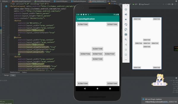
二、LinearLayout 线性布局
LinearLayout (线性布局)管理器是将其中的组件按照水平或者垂直的方向来排列,好比串手链一样,一个一个的串起来然后再按照水平或者垂直的方式排列就可以了
线性布局语法格式:
<LinearLayout xmlns:android="http://schemas.android.com/apk/res/android" //属性列表 // 使用 android:orientation="vertical|Horizontal" 设置排列方式 > </LinearLayout> 12345
LinearLayout的属性:
orientation: 布局排列方式 ,默认 vertical:垂直排列,horizontal:水平排列gravity: 布局管理器中组件的显示位置,选值可以取组合 例如:left|bottomlayout_width: 布局宽度,取wrap_content为包括其自身内容;match_parent为与父容器同宽度layout_height: 布局高度,与layout_width相同,取wrap_content为包括其自身内容;match_parent为与父容器同宽度background: 布局背景id : 用于标识其他组件layout_weight: 权重,用于控制区域的划分实例:
<?xml version="1.0" encoding="utf-8"?> <LinearLayout xmlns:android="http://schemas.android.com/apk/res/android" xmlns:app="http://schemas.android.com/apk/res-auto" xmlns:tools="http://schemas.android.com/tools" android:layout_width="match_parent" android:layout_height="match_parent" android:orientation="vertical" tools:context=".LinearActivity"> <LinearLayout android:layout_width="match_parent" android:layout_height="wrap_content" android:orientation="horizontal"> <Button android:layout_width="wrap_content" android:layout_height="wrap_content" android:layout_weight="1" android:text="1" /> <Button android:layout_width="wrap_content" android:layout_height="wrap_content" android:layout_weight="1" android:text="2" /> <Button android:layout_width="wrap_content" android:layout_height="wrap_content" android:layout_weight="1" android:text="3" /> <Button android:layout_width="wrap_content" android:layout_height="wrap_content" android:layout_weight="1" android:text="+" /> </LinearLayout> <LinearLayout android:layout_width="match_parent" android:layout_height="wrap_content" android:orientation="horizontal"> <Button android:layout_width="wrap_content" android:layout_height="wrap_content" android:layout_weight="1" android:text="4" /> <Button android:layout_width="wrap_content" android:layout_height="wrap_content" android:layout_weight="1" android:text="5" /> <Button android:layout_width="wrap_content" android:layout_height="wrap_content" android:layout_weight="1" android:text="6" /> <Button android:layout_width="wrap_content" android:layout_height="wrap_content" android:layout_weight="1" android:text="-" /> </LinearLayout> <LinearLayout android:layout_width="match_parent" android:layout_height="wrap_content" android:orientation="horizontal"> <Button android:layout_width="wrap_content" android:layout_height="wrap_content" android:layout_weight="1" android:text="7" /> <Button android:layout_width="wrap_content" android:layout_height="wrap_content" android:layout_weight="1" android:text="8" /> <Button android:layout_width="wrap_content" android:layout_height="wrap_content" android:layout_weight="1" android:text="9" /> <Button android:layout_width="wrap_content" android:layout_height="wrap_content" android:layout_weight="1" android:text="*" /> </LinearLayout> <LinearLayout android:layout_width="match_parent" android:layout_height="wrap_content" android:orientation="horizontal"> <Button android:layout_width="wrap_content" android:layout_height="wrap_content" android:layout_weight="1" android:text="0" /> <Button android:layout_width="wrap_content" android:layout_height="wrap_content" android:layout_weight="1" android:text="/" android:background="#047EFD"/> <Button android:layout_width="wrap_content" android:layout_height="wrap_content" android:layout_weight="1" android:text="=" /> </LinearLayout> </LinearLayout>
123456789101112131415161718192021222324252627282930313233343536373839404142434445464748495051525354555657585960616263646566676869707172737475767778798081828384858687888990919293949596979899100101102103104105106107108109110111112113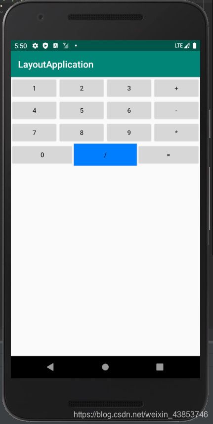
三、FrameLayout 帧布局
FrameLayout(帧布局) 管理器是比较简单的一个布局,这个布局是直接在屏幕上分配一块区域,组件默认置于左上角,这种布局没有任何的定位,布局大小由内部最大控件决定,新创建的控件会覆盖在上一个控件上,就像三明治一样一层一层叠起来,所以帧布局并不常用
帧布局语法格式:
<FrameLayout xmlns:android="http://schemas.android.com/apk/res/android" // 列表属性 > </FrameLayout> 12345
FrameLayout属性:
Foreground: 设置布局管理器的前景色foregroundGravity: 设置前景图像的Gravity属性,即前景图像的显示位置实例:
<?xml version="1.0" encoding="utf-8"?> <FrameLayout xmlns:android="http://schemas.android.com/apk/res/android" xmlns:app="http://schemas.android.com/apk/res-auto" xmlns:tools="http://schemas.android.com/tools" android:layout_width="match_parent" android:layout_height="match_parent" tools:context=".LYXFrameLayoutActivity"> <!-- 第一层在控件的最下面--> <TextView android:layout_width="400dp" android:layout_height="400dp" android:background="#12eb4a" android:text="第一层" android:layout_gravity="center" /> <TextView android:layout_width="300dp" android:layout_height="300dp" android:background="#0000ff" android:text="第二层" android:layout_gravity="center" /> <TextView android:layout_width="200dp" android:layout_height="200dp" android:background="#00deff" android:text="第三层" android:layout_gravity="center" /> <TextView android:layout_width="100dp" android:layout_height="100dp" android:background="#a800ff" android:text="第四层" android:layout_gravity="center" /> </FrameLayout>
12345678910111213141516171819202122232425262728293031323334
四、TableLayout 表格布局
TableLayout 表格布局,顾名思义,即通过表格来管理内部的组件排列,表格管理器通过设定行和列来划分区域,布局管理器中可以设置隐藏,也可以设置伸展或者收缩的属性
表格布局语法:
<TableLayout xmlns:android="http://schemas.android.com/apk/res/android" //列表属性 > <TableRow 列表属性>添加组件</TableRow> <TableRow 列表属性>添加组件</TableRow> <TableRow 列表属性>添加组件</TableRow> ....... </TableLayout> 12345678
TableLayout 继承了LinearLayout ,故支持LinearLayout的所有属性,TableLayout还有以下属性:
collapseColumns: 隐藏列 (序号从0开始,例如要隐藏第一列则写0,隐藏第二列则写1…,多个列用,隔开)shrinkColumns: 收缩列stretchColumns: 拉伸列实例:
<?xml version="1.0" encoding="utf-8"?> <TableLayout xmlns:android="http://schemas.android.com/apk/res/android" xmlns:app="http://schemas.android.com/apk/res-auto" xmlns:tools="http://schemas.android.com/tools" android:layout_width="match_parent" android:layout_height="match_parent" tools:context=".LYXTableLayoutActivity" android:stretchColumns="0" android:shrinkColumns="2"> <TableLayout android:stretchColumns="0"> <TableRow> <Button android:layout_width="wrap_content" android:layout_height="wrap_content" android:text="标题" /> </TableRow> </TableLayout> <TableLayout android:stretchColumns="0" android:shrinkColumns="1" android:collapseColumns="3"> <TableRow> <Button android:layout_width="wrap_content" android:layout_height="wrap_content" android:text="长长的按钮" /> <Button android:layout_width="wrap_content" android:layout_height="wrap_content" android:text="我被压缩了" /> <Button android:layout_width="wrap_content" android:layout_height="wrap_content" android:text="正常的按钮" /> <Button android:layout_width="wrap_content" android:layout_height="wrap_content" android:text="我被隐藏了" /> </TableRow> </TableLayout> <TableLayout android:stretchColumns="0" android:shrinkColumns="1"> <TableRow> <Button android:layout_width="wrap_content" android:layout_height="wrap_content" android:text="正常吗" /> <Button android:layout_width="wrap_content" android:layout_height="wrap_content" android:text="我被压缩了" /> <Button android:layout_width="wrap_content" android:layout_height="wrap_content" android:text="正常的按钮" /> <Button android:layout_width="wrap_content" android:layout_height="wrap_content" android:text="正常的按钮" /> </TableRow> </TableLayout> <TableLayout android:collapseColumns="1"> <TableRow> <Button android:layout_width="wrap_content" android:layout_height="wrap_content" android:text="正常的按钮" /> <Button android:layout_width="wrap_content" android:layout_height="wrap_content" android:text="我被压缩了" /> <Button android:layout_width="wrap_content" android:layout_height="wrap_content" android:text="正常的按钮" /> <Button android:layout_width="wrap_content" android:layout_height="wrap_content" android:text="正常的按钮" /> </TableRow> </TableLayout> <TableLayout android:collapseColumns="0" android:shrinkColumns="1"> <TableRow> <Button android:layout_width="wrap_content" android:layout_height="wrap_content" android:text="我被隐藏了" /> <Button android:layout_width="wrap_content" android:layout_height="wrap_content" android:text="我被压缩了" /> <Button android:layout_width="wrap_content" android:layout_height="wrap_content" android:text="正常的按钮" /> <Button android:layout_width="wrap_content" android:layout_height="wrap_content" android:text="正常的按钮" /> </TableRow> </TableLayout> <TableLayout android:stretchColumns="2" android:shrinkColumns="2"> <TableRow> <Button android:layout_width="wrap_content" android:layout_height="wrap_content" android:text="正常的按钮" /> <Button android:layout_width="wrap_content" android:layout_height="wrap_content" android:text="我被压缩了" /> <Button android:layout_width="wrap_content" android:layout_height="wrap_content" android:text="我被拉伸了" /> </TableRow> </TableLayout> </TableLayout>
123456789101112131415161718192021222324252627282930313233343536373839404142434445464748495051525354555657585960616263646566676869707172737475767778798081828384858687888990919293949596979899100101102103104105106107108109110111112113114115116117118119120121122123124125126127128129130131132133134135136137138139140
五、GridLayout 网格布局
网格布局是在Android4.0 以后提出来的,他与表格布局管理器类似,但比表格布局更加灵活,可以跨行跨列摆放组件
网格布局 语法格式:
<GridLayout xmlns:android="http://schemas.android.com/apk/res/android" //列表属性 > </GridLayout> 12345
GridLayout 属性:
columnCount: 指定网格的最大列数orientation: 设定放入组件的排列方式rowCount: 指定网格的最大行数useDefaultMargins: 指定是否使用默认边距rowOrderPreserves: 设置边界显示的顺序和行索引是否相同alignmentMode: 指定布局管理器的对齐模式columnOrderPreserves: 设置边界显示的顺序和列索引是否相同为了控制各个组件的排列,网格布局管理器还有以下属性:
layout_column: 指定该组件位于网格的第几列layout_columnSpan指定该组件横向跨几列(索引从0开始)layout_columnWeight: 指定该组件列上的权重layout_gravity: 指定该组件用什么方式占据网格的空间layout_row: 指定该组件位于网格的第几行layout_rowSpan: 指定组件纵向跨几行layout_rowWeight: 指定该组件行上的权重注意:如果一个组件需要设置跨行或者跨列,需要先设置layout_columnSpan或者layout_cowSpan,然后在设置layout_gravity属性为fill,这样就可以填满横跨的行或列
实例:
<?xml version="1.0" encoding="utf-8"?> <GridLayout xmlns:android="http://schemas.android.com/apk/res/android" xmlns:app="http://schemas.android.com/apk/res-auto" xmlns:tools="http://schemas.android.com/tools" android:layout_width="match_parent" android:layout_height="match_parent" android:columnCount="4" android:rowCount="6" tools:context=".LYXGridLayoutActivity"> <EditText android:layout_columnSpan="4" android:layout_gravity="top|right" android:layout_marginLeft="5dp" android:background="#fff" android:text="0" android:textSize="50dp"/> <Button android:text="+" android:layout_columnWeight="1" android:layout_rowWeight="1" android:textSize="20dp" android:textColor="#00f"/> <Button android:text="-" android:layout_columnWeight="1" android:layout_rowWeight="1" android:textSize="20dp"/> <Button android:text="*" android:layout_columnWeight="1" android:layout_rowWeight="1" android:textSize="20dp"/> <Button android:text="/" android:layout_columnWeight="1" android:layout_rowWeight="1" android:textSize="20dp"/> <Button android:text="1" android:layout_columnWeight="1" android:layout_rowWeight="1" android:textSize="20dp"/> <Button android:text="2" android:layout_columnWeight="1" android:layout_rowWeight="1" android:textSize="20dp"/> <Button android:text="3" android:layout_columnWeight="1" android:layout_rowWeight="1" android:textSize="20dp"/> <Button android:text="%" android:layout_columnWeight="1" android:layout_rowWeight="1" android:textSize="20dp"/> <Button android:text="4" android:layout_columnWeight="1" android:layout_rowWeight="1" android:textSize="20dp"/> <Button android:text="5" android:layout_columnWeight="1" android:layout_rowWeight="1" android:textSize="20dp"/> <Button android:text="6" android:layout_columnWeight="1" android:layout_rowWeight="1" android:textSize="20dp"/> <Button android:text="." android:layout_columnWeight="1" android:layout_rowWeight="1" android:textSize="20dp"/> <Button android:text="7" android:layout_columnWeight="1" android:layout_rowWeight="1" android:textSize="20dp"/> <Button android:text="8" android:layout_columnWeight="1" android:layout_rowWeight="1" android:textSize="20dp"/> <Button android:text="9" android:layout_columnWeight="1" android:layout_rowWeight="1" android:textSize="20dp"/> <Button android:text="=" android:layout_rowSpan="2" android:layout_gravity="fill" android:background="#047EFD" android:layout_columnWeight="1" android:layout_rowWeight="1" android:textSize="20dp"/> <Button android:text="C" android:layout_gravity="fill_horizontal" android:layout_columnWeight="2" android:layout_rowWeight="1" android:layout_columnSpan="2" android:textSize="20dp"/> <Button android:text="0" android:layout_rowSpan="1" android:layout_columnWeight="1" android:layout_rowWeight="1" android:textSize="20dp"/> </GridLayout>
123456789101112131415161718192021222324252627282930313233343536373839404142434445464748495051525354555657585960616263646566676869707172737475767778798081828384858687888990919293949596979899100101102103104105106107108109110111112113114115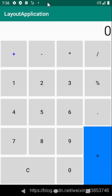
六、ConstraintLayout 约束布局
ConstraintLayout 是Android Studio 2.2提出的新的可视化操作布局方
掌握Constraint Layout的使用:
https://blog.csdn.net/guolin_blog/article/details/53122387
相关知识
HTML5移动开发
【Android开发那点破事】Android中Activity的生命周期
探秘移动开发新灵感:利用“仿闲鱼发布页”资源快速提升技能
基于Android的车载智能监测系统的应用与研究
基于Android系统的花卉识别APP界面设计与实现
基于Android平台智能花卉养护系统.doc
移动设备签到应用开发大家给点开发
基于Android的水稻病虫害图像的识别与诊断系统
深度学习农作物病虫害智能识别APP开发教程
基于node.js+vue基于Android的平台书架的设计与实现后(开题+程序+论文)计算机毕业设计
原文链接: Android 移动开发 https://m.huajiangbk.com/newsview546063.html
| 上一篇: 安卓移动应用开发课程设计(图书借... | 下一篇: 2022年河南省高等职业教育技能... |